Collectible UI · Streetwear, dark and light.
Two collectible interface directions contrast orange-on-dark with gold-on-light across discovery, details, sharing, announcements and personal collections.
My work: Interface visuals, icons and interaction states
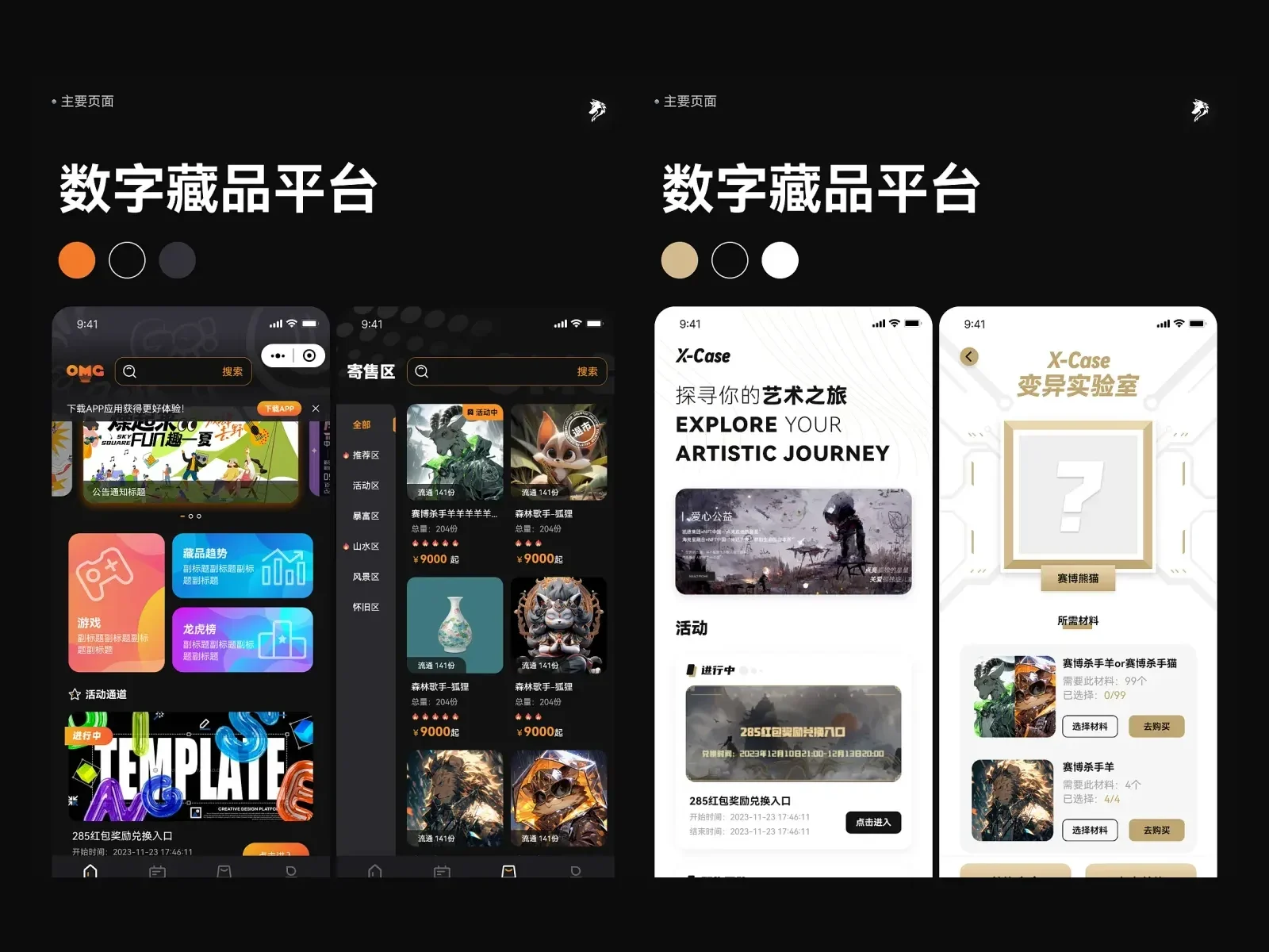
One content domain, two personalities
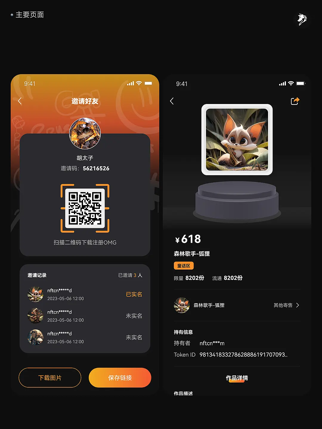
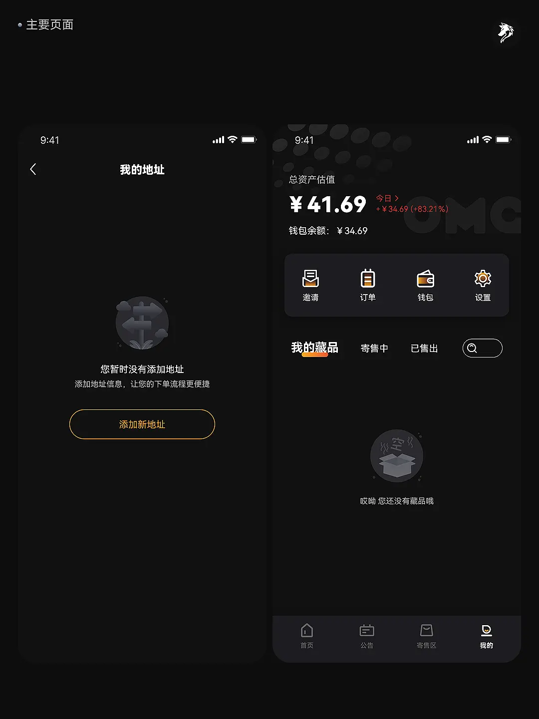
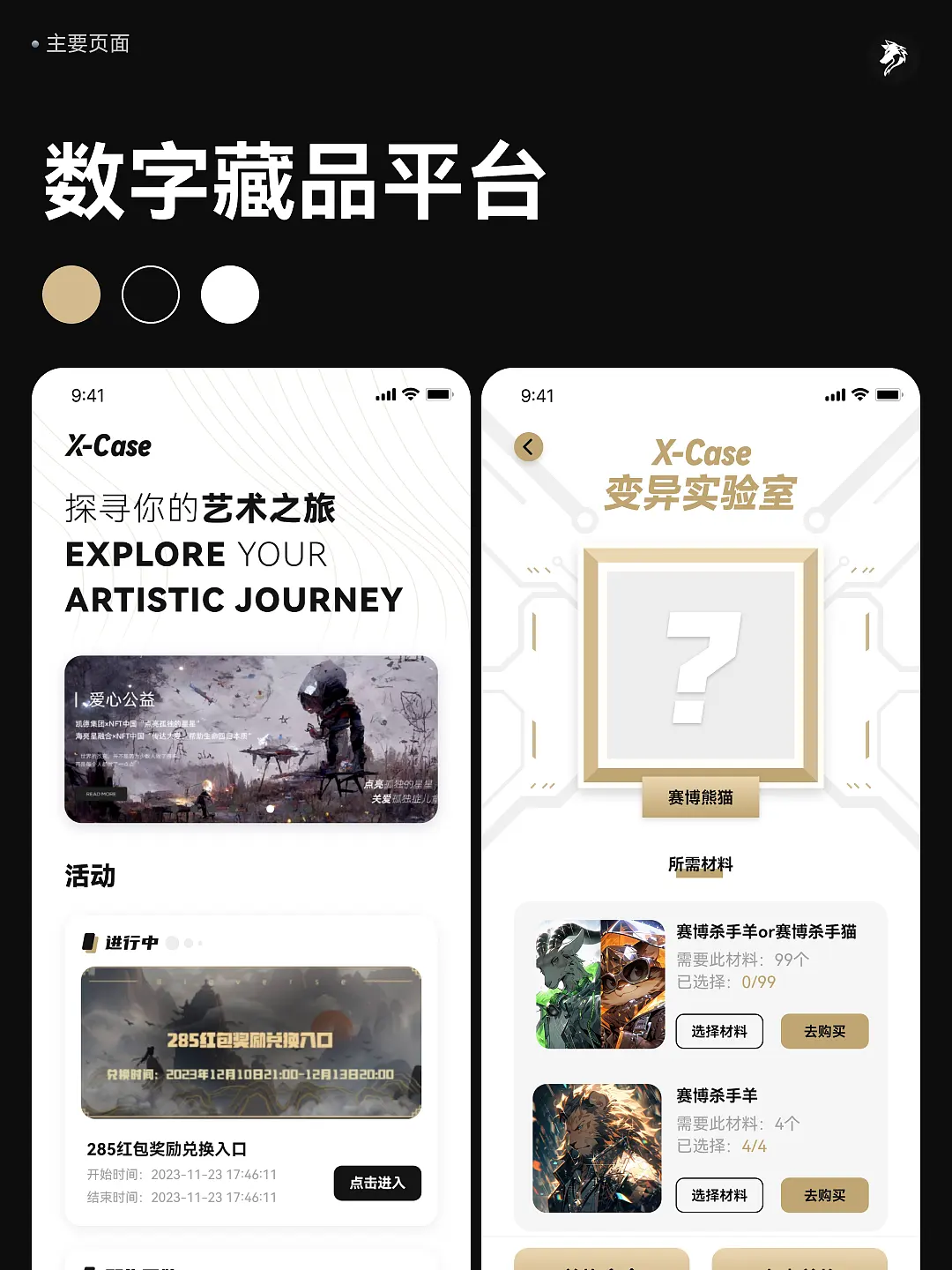
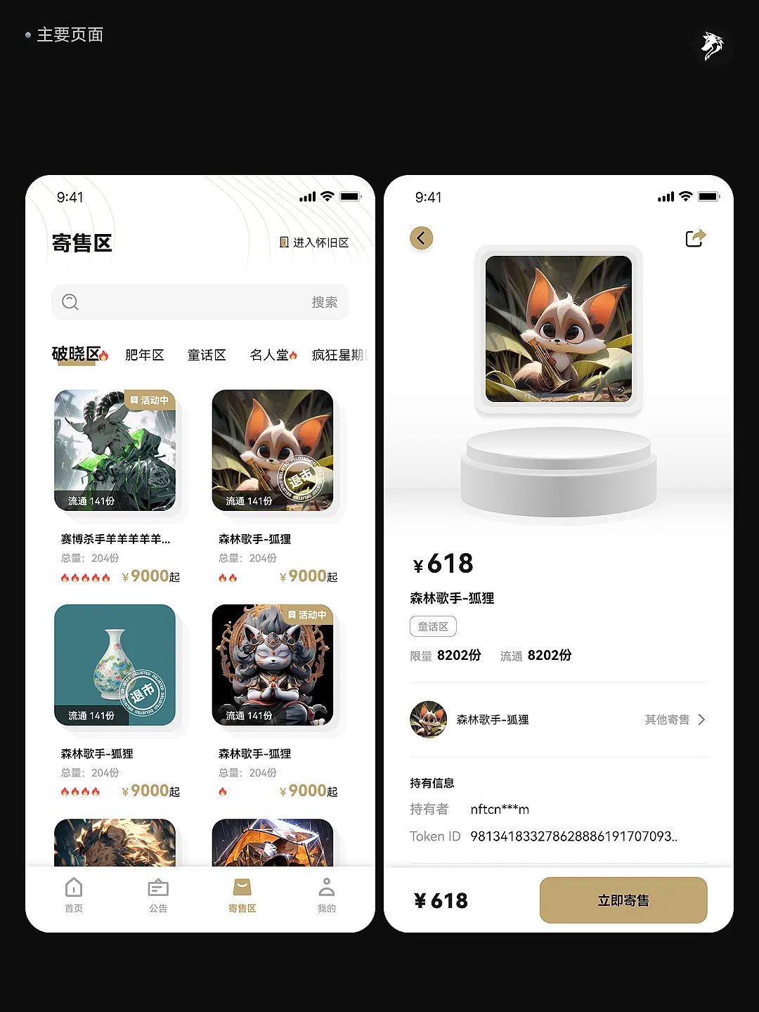
These two interface directions explore contrasting personalities. The streetwear scheme combines dark surfaces, orange actions and vivid campaign imagery. The light scheme uses white surfaces, gold accents and lighter dividers to place more emphasis on the artwork itself.
A hierarchy around the artwork
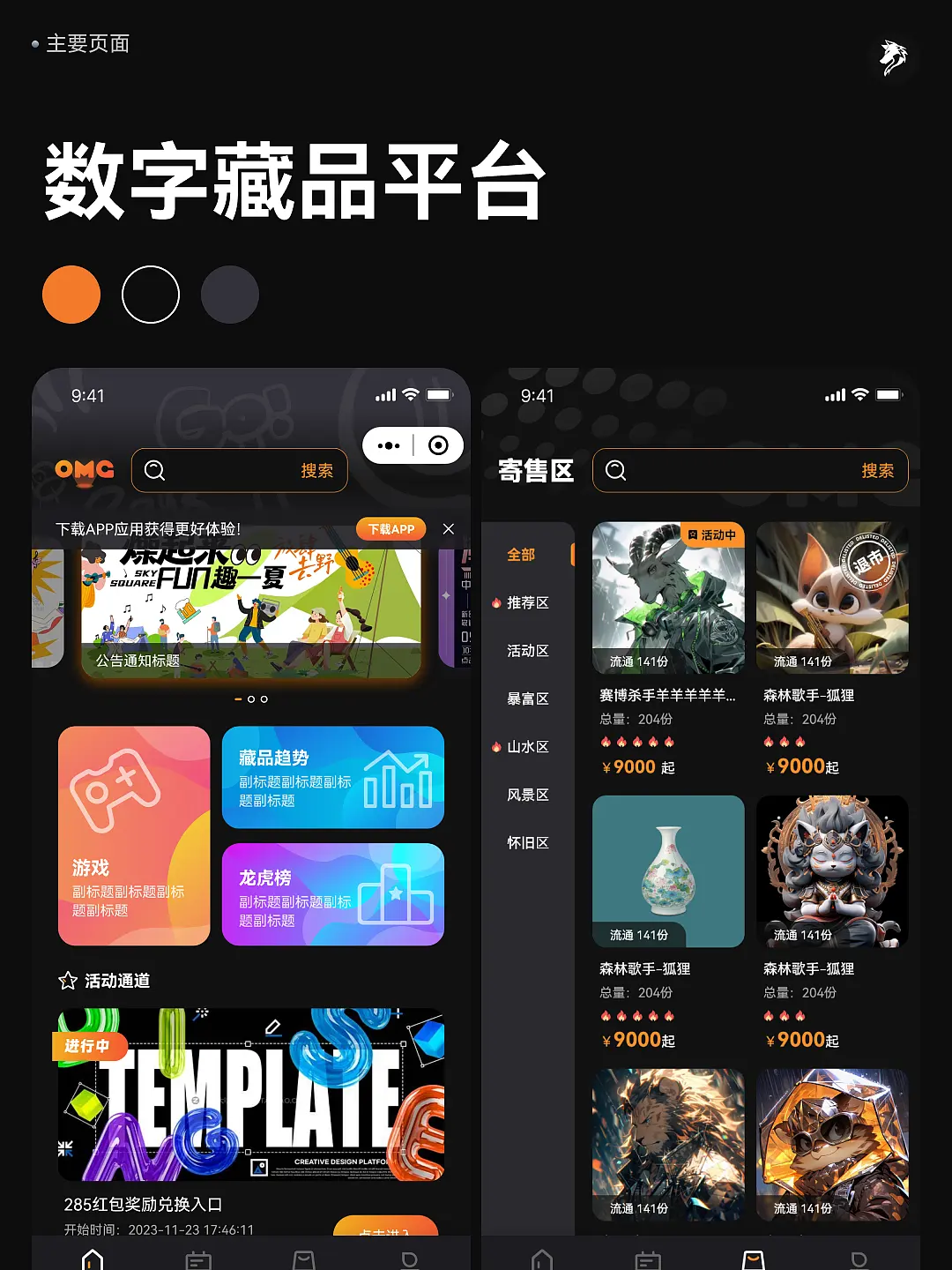
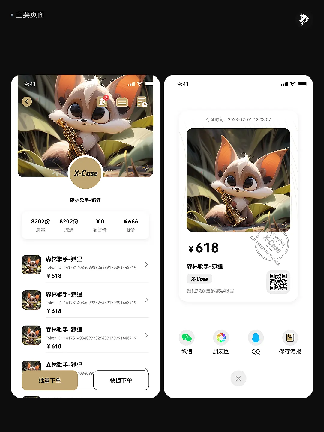
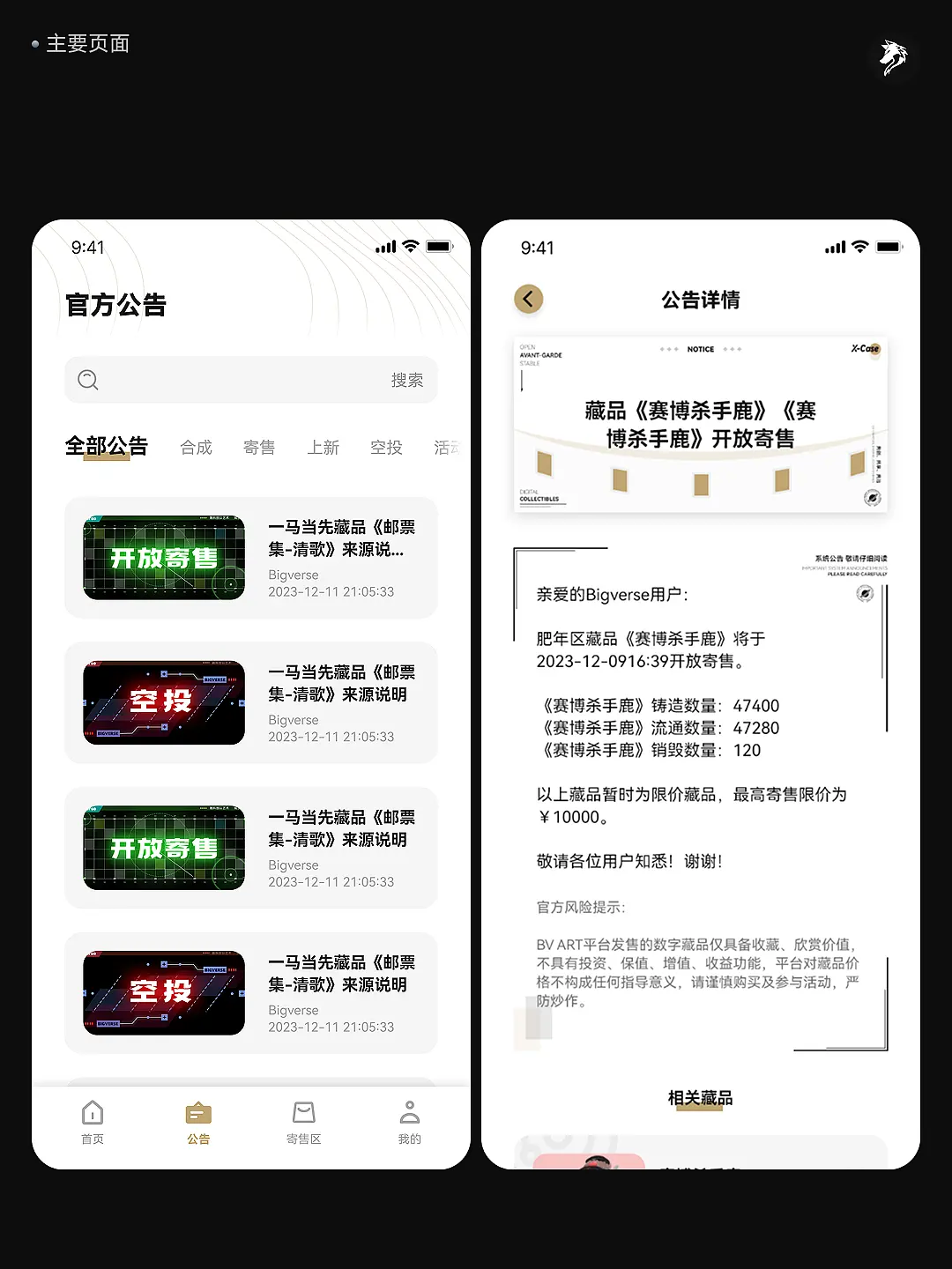
Home screens support campaign and artwork discovery, lists emphasise covers and status, and detail screens consolidate item information. Sharing cards preserve key imagery and identification; announcements use a more continuous reading layout. Expression changes by context while hierarchy remains coherent.
Designing the supporting states
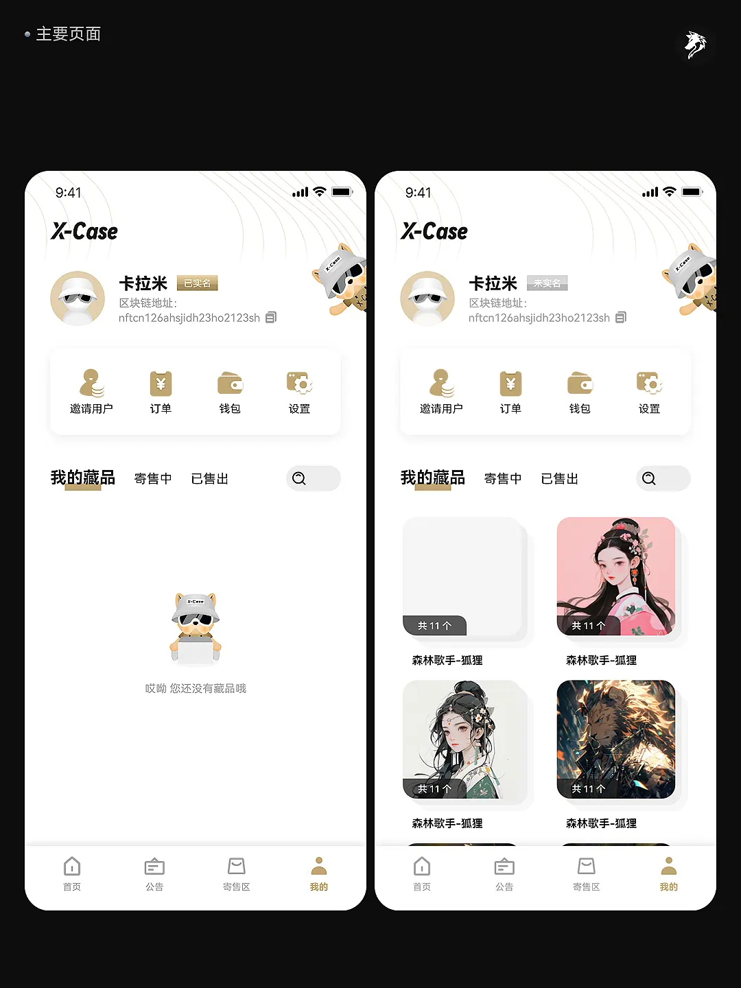
The boards include sign-in, loading, empty address lists, collection categories and listing states alongside the main screens. Shared colour, icon and button rules keep each direction coherent from entry to personal content management.
The design in detail
12 original studies · Original proportions. Open images for a closer look.
01 / Streetwear dark
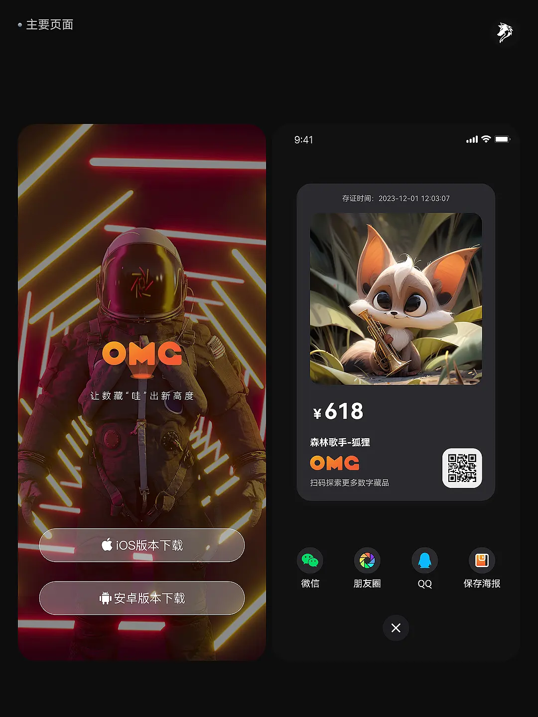
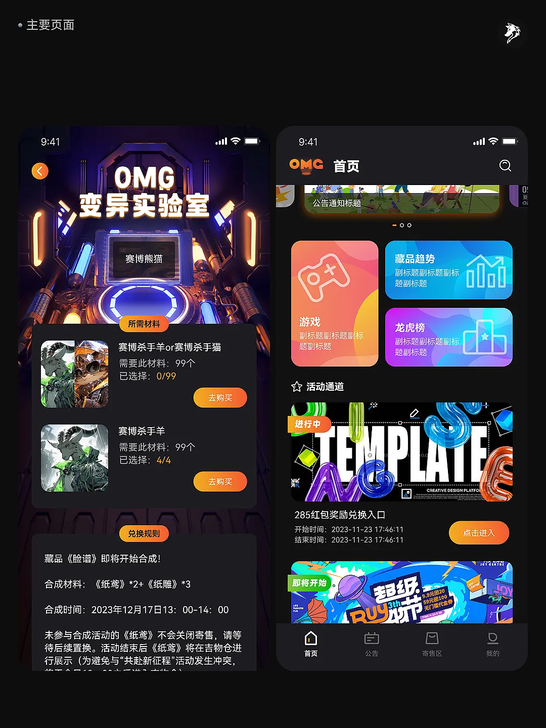

02 / Light gold

Design focus
- Visual systems
- Dark & light
- Mobile UI